
Spectrum Analysis Australia Schools Update 2024
Spectrum Analysis Australia Schools Update 2024 By Peter Buckingham Here at Spectrum Analysis Australia, we have been working with Independent and Catholic schools since 2003. The first two schools to work with us were Brighton Grammar and Firbank Grammar School. So now that we have been doing this work for more than 20 years, we thought we would share an
ACARA (Australian Curriculum, Assessment and Reporting Authority) Australian Data Release 2024
ACARA (Australian Curriculum, Assessment and Reporting Authority) Australian Data Release 2024 By Peter Buckingham Whether you are a Principal, Board Member, Business Manager, Enrolment and Admissions Manager, or some other senior executive within your school, the ACARA data tells you how the schools market is going overall and how your school is going by comparison. ACARA data gives us the
Educate Plus Victoria Tasmania Chapter Sponsor
Educate Plus Victoria Tasmania Chapter Sponsor By Peter Buckingham Spectrum Analysis Australia was an Educate Plus Victoria Tasmania Summit Partner in 2023 and is very proud to be a sponsor of the Educate Plus Victoria Tasmania Chapter in 2024. This will allow us to provide useful information to schools across the two states. We will be attending local events and
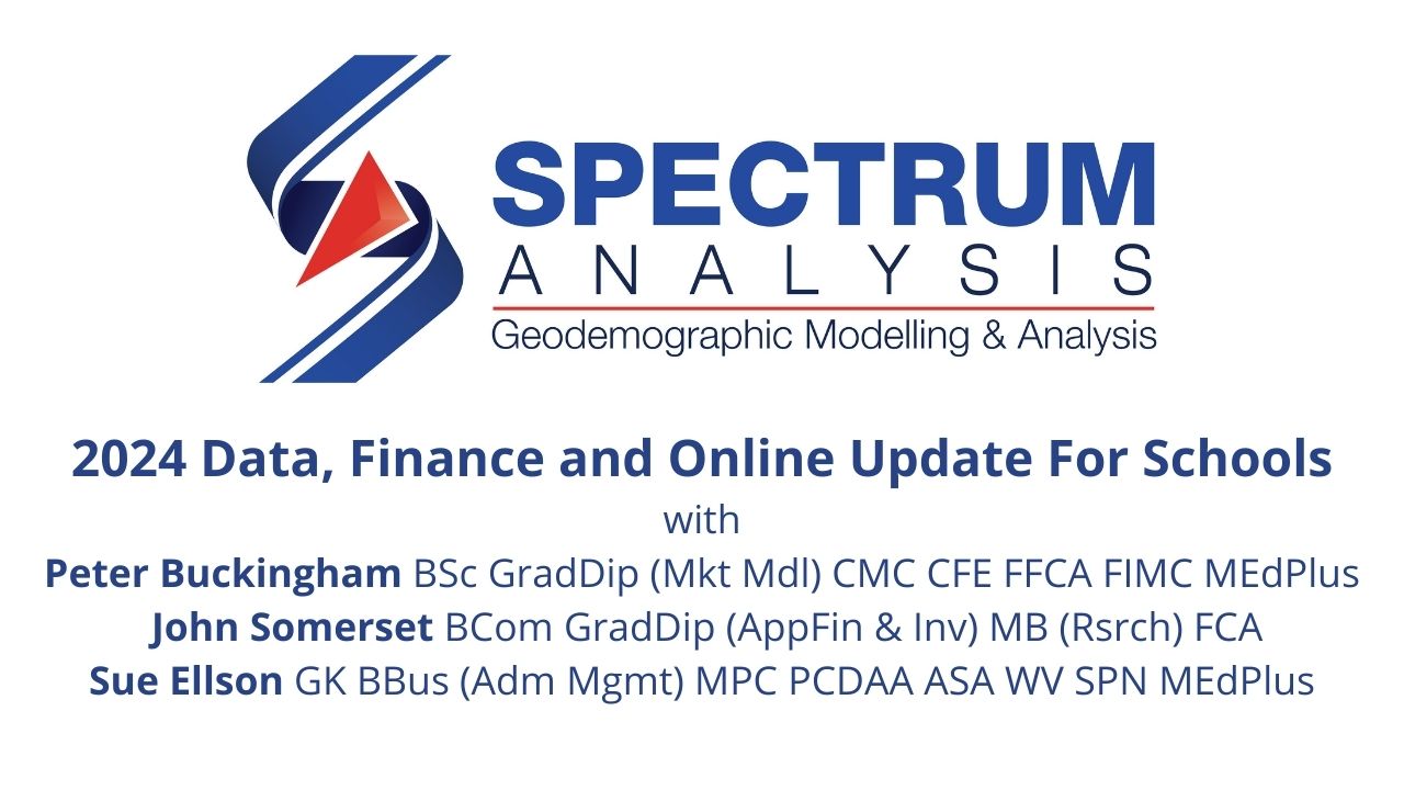
2024 Data, Finance and Online Update For Schools
2024 Data, Finance and Online Update For Schools Topic: 2024 Data, Finance and Online Update For SchoolsDate: 12 March 2024 at 12:00pm Melbourne AEDT UTC+11 Organisation: Spectrum Analysis Australia Speakers: Peter Buckingham, John Somerset and Sue EllsonLinkedIn: https://www.linkedin.com/events/2024data-financeandonlineupdate7164064708143108096 (with guest list)Eventbrite Tickets: https://spectrumanalysis13.eventbrite.com.auYouTube Recording Link: https://www.youtube.com/watch?v=HIaBVNfG194 (and below)Slides: https://spectrumanalysis.com.au/wp-content/uploads/20240312-spectrum-analysis-australia-2024-data-finance-and-online-update-by-peter-buckingham-john-somerset-and-sue-ellson.pdf (and below)Show Notes: A brief summary: 🏫 changing enrolments for schools across Australia 🏫
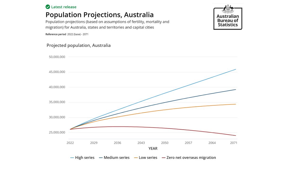
ABS Capital City State and National Population Projections from 2022 to 2071
ABS Capital City, State and National Population Projections from 2022 to 2071 By Anuhhav Tewari The Australian Bureau of Statistics (ABS) recently released the capital city, state and national level population projections from 2022 to 2071. These projections illustrate what would happen to Australia’s population if assumed levels of the components of population change (births, deaths and migration) were to
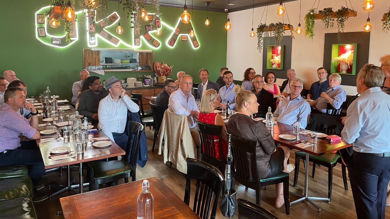
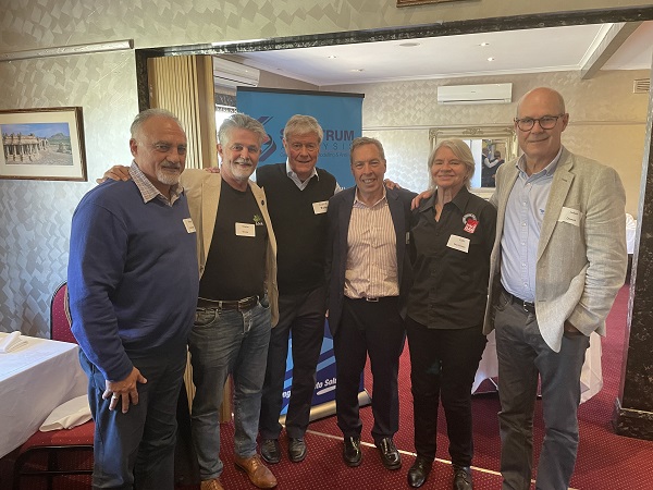
Institute of Management Consultants Lunch 5 December 2023
Date: 5 December 2023Title: Institute of Management Consultants Lunch jointly hosted by the Institute of Management Consultants and Spectrum Analysis AustraliaEvent Listed: https://imc.org.au/events/#!event/2023/12/5/victas-chapter-christmas-consultants-lunchVenue: Okra, 180 Camberwell Road, Hawthorn East, Melbourne, Victoria, 3123Photos: BelowOrganised by: John Downes, Dianne Semmens, Peter Buckingham, Stephen Wood On Tuesday 5 December 2023, John Downes, Dianne Semmens, Stephen Wood and Peter Buckingham jointly hosted the Institute of Management Consultants Lunch at
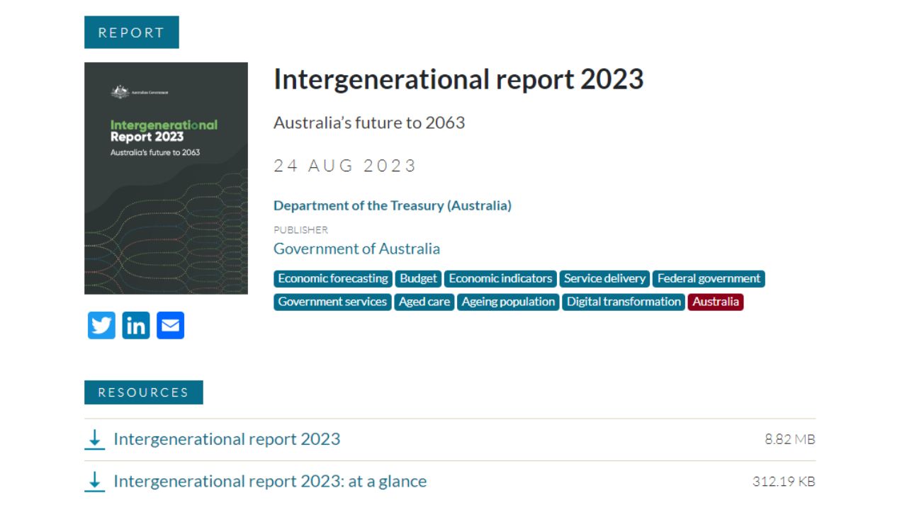
Intergenerational Report 2023 Summary
Intergenerational Report 2023 Summary By Peter Buckingham and Anubhav Tewari The Sixth Intergenerational Report was released on 24 August 2023 by our current treasurer Jim Chalmers. This document is the summation of what the Government expects Australia to do in terms of populations and broad demographics over the next 40 years, and comes with quite a lot of “provisos” to
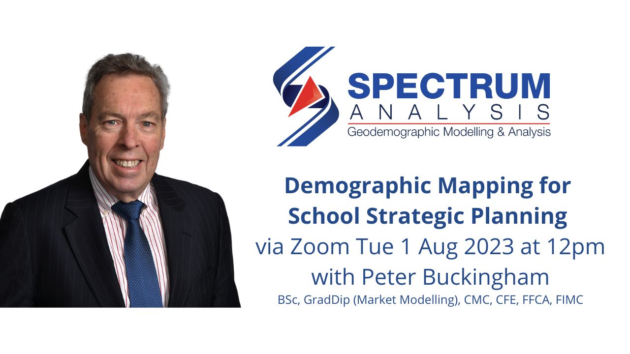
Demographic Mapping for School Strategic Planning
Demographic Mapping for School Strategic Planning Topic: Demographic Mapping for School Strategic PlanningDate: 1 August 2023 at 12:00pm Melbourne AEST UTC+10 Organisation: Spectrum Analysis Australia Speaker: Peter Buckingham LinkedIn Guests: https://www.linkedin.com/events/demographicmappingforschoolstra7085376038716768257Eventbrite Link: https://spectrumanalysis12.eventbrite.com.auYouTube Recording Link: https://www.youtube.com/watch?v=dkuwEntZ20wSlides: Below Show NotesHere are some additional reference points: Shared on Facebook, Google, LinkedIn Page, LinkedIn Profile
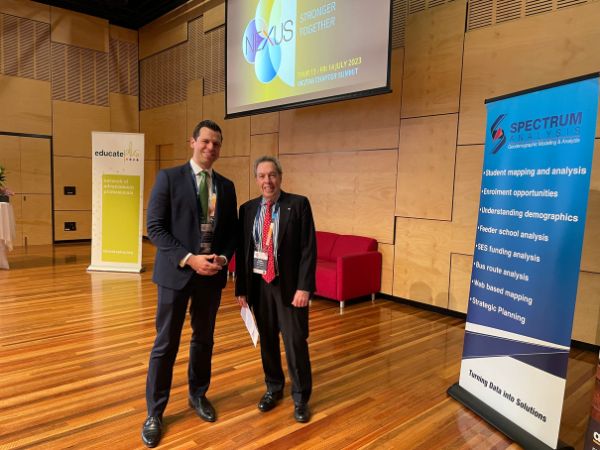
Educate Plus Victoria Tasmania Chapter Summit Siena College Camberwell Melbourne
Date: 13-14 July 2023 Title: Educate Plus Victoria Tasmania Chapter Summit Event Listed: https://www.educateplus.edu.au/2023-vic-tas-chapter-summit Program: https://www.educateplus.edu.au/wp-content/uploads/2023/07/VIC-TAS-SUMMIT-Full-Program-FINAL.pdf Venue: Siena College, 815 Riversdale Road, Camberwell, Melbourne, Victoria, Australia 3124 Photos: Below Organised by: Educate Plus Victoria / Tasmania Chapter Committee Spectrum Analysis Australia was a Summit Partner and was very proud to be actively involved in this event, the first chapter summit in Victoria and
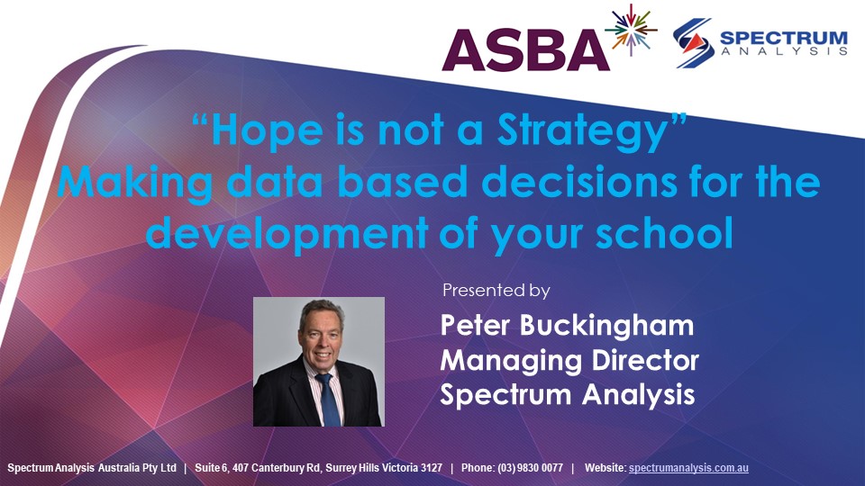
ASBA Webinar – Hope is not a Strategy
ASBA Webinar – Hope is not a Strategy By Peter Buckingham Date: 11 May 2023Title: Hope Is Not A StrategyEvent: Association of School Business Administrators ASBA Webinarhttps://asba.asn.au/?action=showReunion&reunionName=E207Venue: OnlineSlides: View and download belowRecording: Available to members via the ASBA website in the Members’ Area / Member Services Directory / Webinars Social Media Shares:Facebook Spectrum AnalysisGoogle Profile Peter BuckinghamGoogle Profile Spectrum Analysis AustraliaLinkedIn Peter BuckinghamLinkedIn Spectrum AnalysisTwitter

Institute of Management Consultants Lunch 1 June 2023
Date: 1 June 2023Title: Institute of Management Consultants Lunch jointly hosted by the Institute of Management Consultants and Spectrum Analysis AustraliaEvent Listed: https://www.linkedin.com/events/internationalmanagementconsulta7064849694589423616https://imc.org.au/events/#!event/register/2023/6/1/victas-chapter-celebrating-international-management-consultants-day-8211-with-a-time-for-tandooriVenue: Tandoori Den, 261 Camberwell Road, Camberwell, Melbourne, Victoria, 3124Photos: BelowOrganised by: John Downes, Dianne Semmens, Peter Buckingham, Stephen Wood On Thursday 1 June 2023, John Downes, Dianne Semmens, Stephen Wood and Peter Buckingham jointly hosted the Institute of Management Consultants Lunch at Tandoori
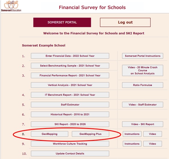
Spectrum Analysis and Somerset Education Online Mapping for Schools
Spectrum Analysis and Somerset Education Online Mapping for Schools By Peter Buckingham Spectrum Analysis and Somerset Education are proud of their on-going relationship to provide online mapping to schools through the Somerset Education Portal. We are pleased to announce that updated information is now available through the Somerset Education Portal and Spectrum Analysis GeoMapping and GeoMapping Plus Products. The Somerset
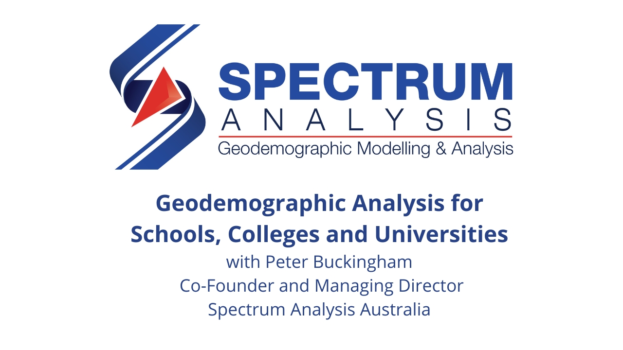
Geodemographic Analysis for Schools Colleges and Universities
Geodemographic Analysis for Schools Colleges and Universities Topic: Geodemographic Analysis for Schools Colleges and Universities Date: 15 February 2023 at 12:00pm Melbourne AEDT UTC+11 Organisation: Spectrum Analysis Australia Speaker: Peter Buckingham LinkedIn Guests: https://www.linkedin.com/events/geodemographicanalysisforschool7001308785046695937 YouTube Link: https://www.youtube.com/watch?v=UuMVLx_ivZoSlides below Show NotesAs per the discussion, here are some additional reference points: Shared on Facebook, Google, LinkedIn Page, LinkedIn Profile

Early Education and Child Care Centre Data Mapping
Early Education and Child Care Centre Data Mapping By Peter Buckingham Spectrum Analysis have upgraded their online mapping for schools with the inclusion of the Australian Children’s Education and Care Quality Authority ACEQA preschool, early education, child care and outside school hours care centres’ data. We have mapped the public records of 17,007 early education centres across Australia. The data
Strategic Planning for Schools Colleges and Universities in 2023
Strategic Planning for Schools, Colleges and Universities in 2023 By Peter Buckingham Welcome back from what we hope were great holidays over Christmas and the New Year period. Hopefully you are feeling refreshed and looking forward to starting 2023! The politicians and the economists are saying it could be a challenging year. We have been hearing that there will probably

Australian Bureau of Statistics ABS 2022 Business Demographics Just Released
Australian Bureau of Statistics ABS 2022 Business Demographics Just Released By Peter Buckingham Many of our clients are specifically B2B businesses and once a year the Australian Bureau of Statistics (ABS) releases annual business statistics. This year, the 2022 data reflecting business numbers on the 30th of June 2022 was released much earlier than we would normally expect. The data
Australian Bureau of Statistics ABS Census 2021 Statistics To Share
Australian Bureau of Statistics ABS Census 2021 Statistics To Share By Peter Buckingham If you would like to sound like a five minute expert on demographics, here are some fun facts you may want to share with your friends and family this holiday season. However, please remember that an Expert (or X-spurt) can also be defined as “X – is

End of Year Lunch at St Cloud Eating House Hawthorn East
End of Year Lunch at St Cloud Eating House Hawthorn East On Tuesday 6 December 2022, the team from Spectrum Analysis Australia based in Melbourne met for an end of year lunch at St Cloud Eating House in Hawthorn East. We enjoyed the fabulous range of food for entree and then found out the main course was still to come!
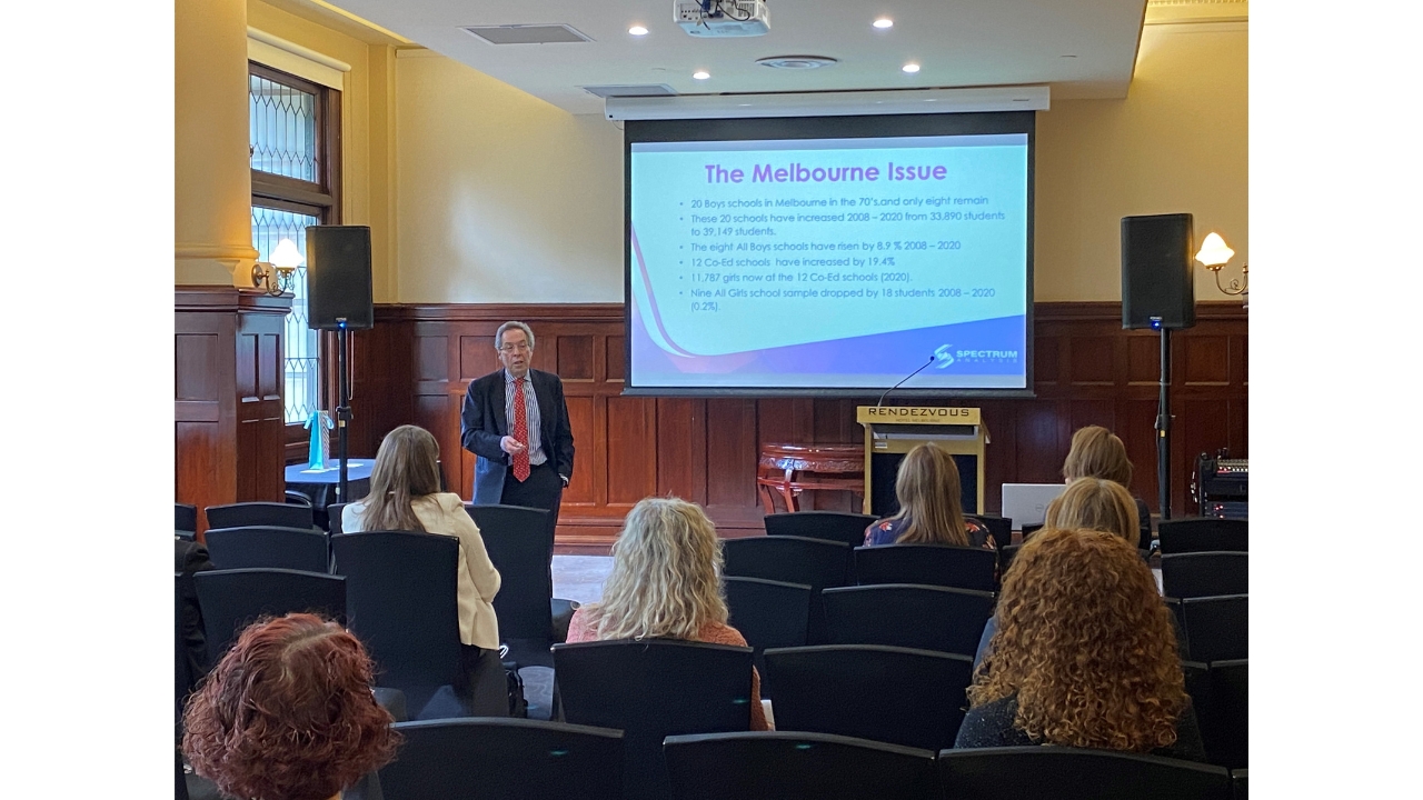
Hope Is Not A Strategy – Catholic Development Network Conference
Hope Is Not A Strategy – Catholic Development Network Conference By Peter Buckingham Date: 25 November 2022Title: Hope Is Not A StrategyEvent: Catholic Development Network Elevate Conference https://cdn.edu.au/conference/conference-detailVenue: Rendezvous Hotel, 328 Flinders Street, MelbourneSlides: View and download below Thank you to David Formosa from St Mary’s College, St Kilda for taking the photo. Social Media Shares: Facebook Spectrum AnalysisGoogle Profile
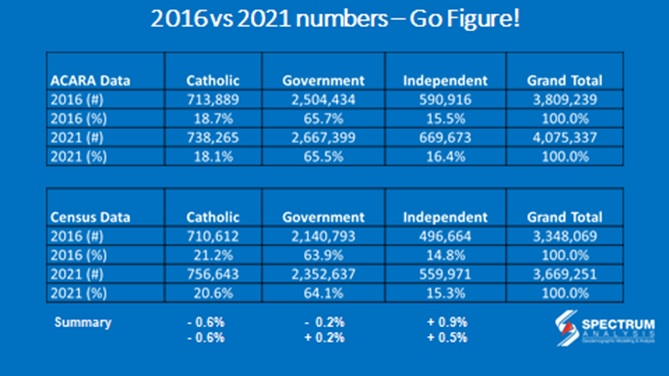
Comparing Data Can Be Difficult
Comparing Data Can Be Difficult By Peter Buckingham When we compare data from different sources, you can come up with slightly different conclusions. Normally the issue is in the way the data is collected, or the different way the questions are asked. At Spectrum Analysis, we are often asked by schools, what is the change in enrolment numbers (in general)

Pinot and Picasso Abbotsford Team Fun Day
Pinot and Picasso Abbotsford Team Fun Day By Peter Buckingham On Thursday 15 September 2022, the Spectrum Analysis Australia team spent the afternoon at Pinot and Picasso at 463 Victoria Street, Abbotsford. The delightful Isabelle showed us how to put our painting skills to the test! We all agreed that if we spent as many hours painting as we have

Top 50 Australian Small Business Leaders 2022
Top 50 Australian Small Business Leaders 2022 By Peter Buckingham Last night, I was awarded one of the Top 50 Small Business Leaders in the Octomedia Inside Small Business Awards 🏆 at the Alto Space, Top Floor of the Melbourne GPO Building, Corner of Elizabeth & Little Bourke Streets, Melbourne Victoria Australia 3000. I would like to personally congratulate all
GeoMapping Plus with ABS Census Data 2021 Update
GeoMapping Plus with ABS Census Data 2021 Update By Peter Buckingham We are pleased to release a quick video on how our GeoMapping Plus product has been updated with the Australian Bureau of Statistics (ABS) Census Data from 2021. This product is available for our Spectrum Analysis Australia clients as well as for schools using the Somerset Education Schools Financial
Independent Schools FTE Enrolments
Independent schools are flying into the future, how is your State fairing overall in the sector… By Peter Buckingham Peter Buckingham is the Managing Director of Spectrum Analysis, a Melbourne based consultancy in demographics, mapping and analysis specializing in schools. Peter is both a CMC (Certified Management Consultant) and a Fellow of the Institute of Management Consultants (FIMC). Peter can
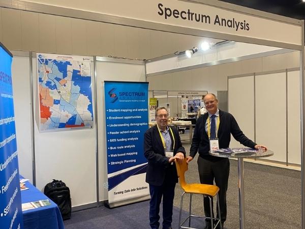
Australian Conference on Lutheran Education #ACLE6
By Peter Buckingham The Australian Conference on Lutheran Education (ACLE) #ACLE6 One Voice, Many Paths was held at the Melbourne Convention and Exhibition Centre from 6 – 8 July 2022 and Spectrum Analysis Australia hosted stand number 38. We enjoyed some excellent presentations and it was fabulous to catch up with John Somerset FCA of Somerset Education, Cole School Experts
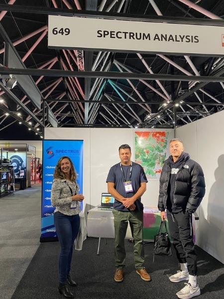
Fitness and Wellness Show Sydney
Fitness and Wellness Show Sydney By Peter Buckingham Spectrum Analysis Australia hosted stand number 649 at the Fitness and Wellness Show in Sydney at the ICC Sydney Convention & Exhibition Centre from 16-17 June 2022. I presented on the topic of ‘Using geographic and demographic local area data to make strategic, profit focused decisions’ on Thursday 16 June 2022 at
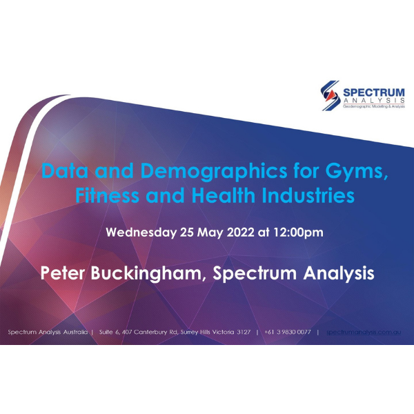
Data and Demographics for Gyms, Fitness Centres, Health and Wellness
Data and Demographics for Gyms, Fitness Centres, Health and Wellness Date: 25 May 2022 Format: Online Webinar via Zoom Title: Data and Demographics for Gyms, Fitness Centres, Health and Wellness Presenters: Peter Buckingham, Co-Founder and Managing Director of Spectrum Analysis Chat Manager: Dorianne Lyons, Business Development Manager of Spectrum Analysis LinkedIn Registered Guests: https://www.linkedin.com/events/data-demographicsforgyms-fitnes6894247463578939393 Video Recording on YouTube: https://www.youtube.com/watch?v=yMwGjQ1FU30 (and below) PowerPoint Slides: https://spectrumanalysis.com.au/wp-content/uploads/20220525-data-and-demographics-for-gyms-fitness-centres-health-and-wellness-peter-buckingham-spectrum-analysis-australia.pdf (and below) Say Thank You
Management Consultants Lunch 24 May 2022
Management Consultants Lunch 24 May 2022 On Tuesday 24 May 2022, Peter Buckingham from Spectrum Analysis hosted the combined Institute of Management Consultants Lunch at Tandoori Den at 260 Camberwell Road, Camberwell, Melbourne, Victoria, Australia, 3124. The special guest speaker was well known football coach David Parkin who is also a patron of the Male Bag Foundation that raises funds
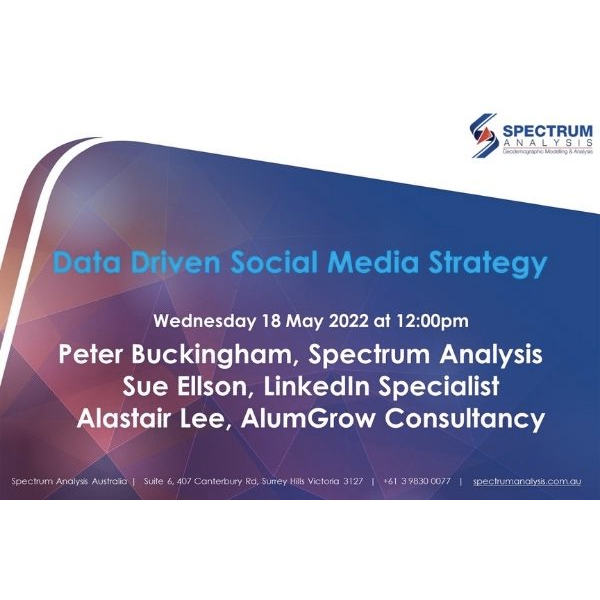
Data Driven Social Media Strategy for Schools Colleges and Universities
Data Driven Social Media Strategy for Schools Colleges and Universities Date: 18 May 2022 Format: Online Webinar via Zoom Title: Data Driven Social Media Strategy for Schools Colleges and Universities Presenters: Peter Buckingham, Co-Founder and Managing Director of Spectrum Analysis Alastair Lee, Director and Founder, AlumGrow Consultancy Sue Ellson, Founder and Director, 120 Ways Publishing Chat Manager: Dorianne Lyons, Business Development Manager of Spectrum
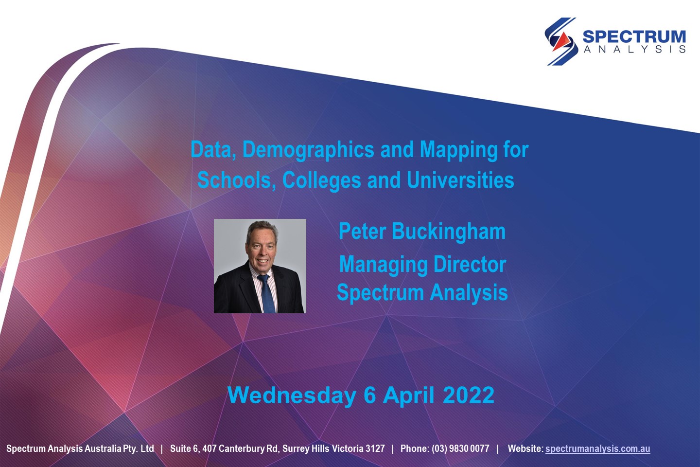
Data and Demographics for Schools Colleges and Universities
Date: 6 April 2022 Format: Online Webinar via Zoom Title: Data and Demographics for Schools Colleges and Universities with Peter Buckingham from Spectrum Analysis Presenter: Peter Buckingham, Co-Founder and Managing Director of Spectrum Analysis Chat Manager: Sue Ellson, Marketing Consultant for Spectrum Analysis LinkedIn Registered Guests: https://www.linkedin.com/events/data-demographicsforschoolscoll6906481440893091840 Video Recording on YouTube: https://www.youtube.com/watch?v=L29izkbyrEU (and below) PowerPoint Slides: https://spectrumanalysis.com.au/wp-content/uploads/20220406-data-demographics-and-mapping-for-schools-colleges-and-universities-peter-buckingham-spectrum-analysis-australia.pdf (and below) Say Thank You with an Informative